Welcome to the Vulnpocalypse. This is the counter I keep running in the corner of the screen so I can watch the CVE pipeline lap every year that came before it. Every chart here is one more angle on the same story: how fast CVEs are being published, and how far ahead of the years before it the current pace is running. Data is from the Vulners CVE archive. Grab a coffee before you scroll.
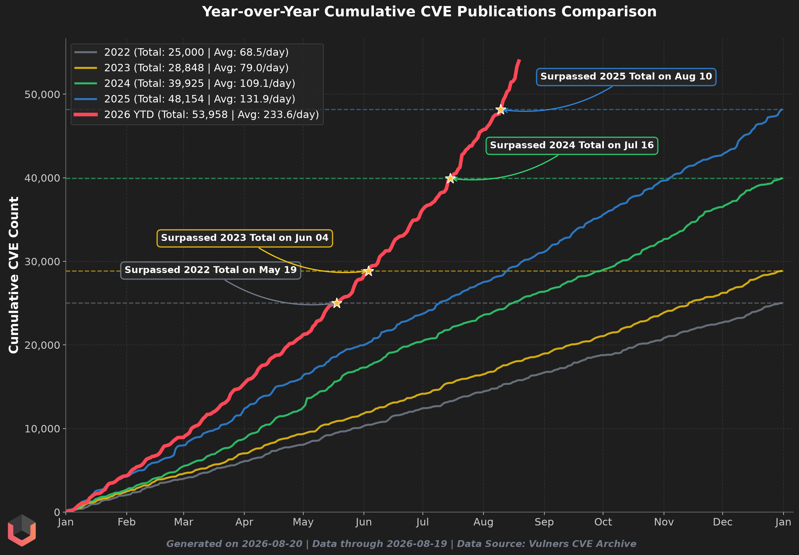
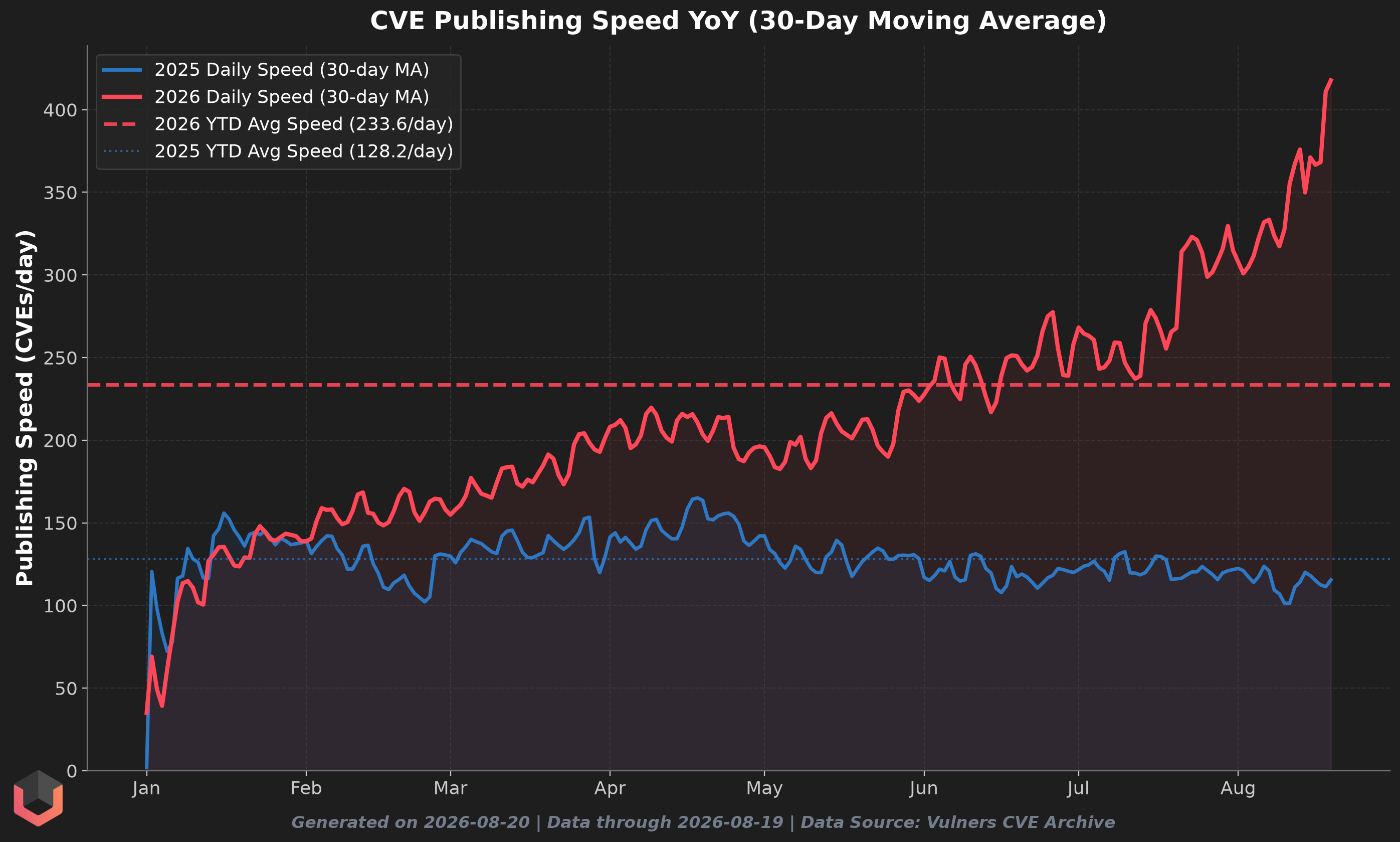
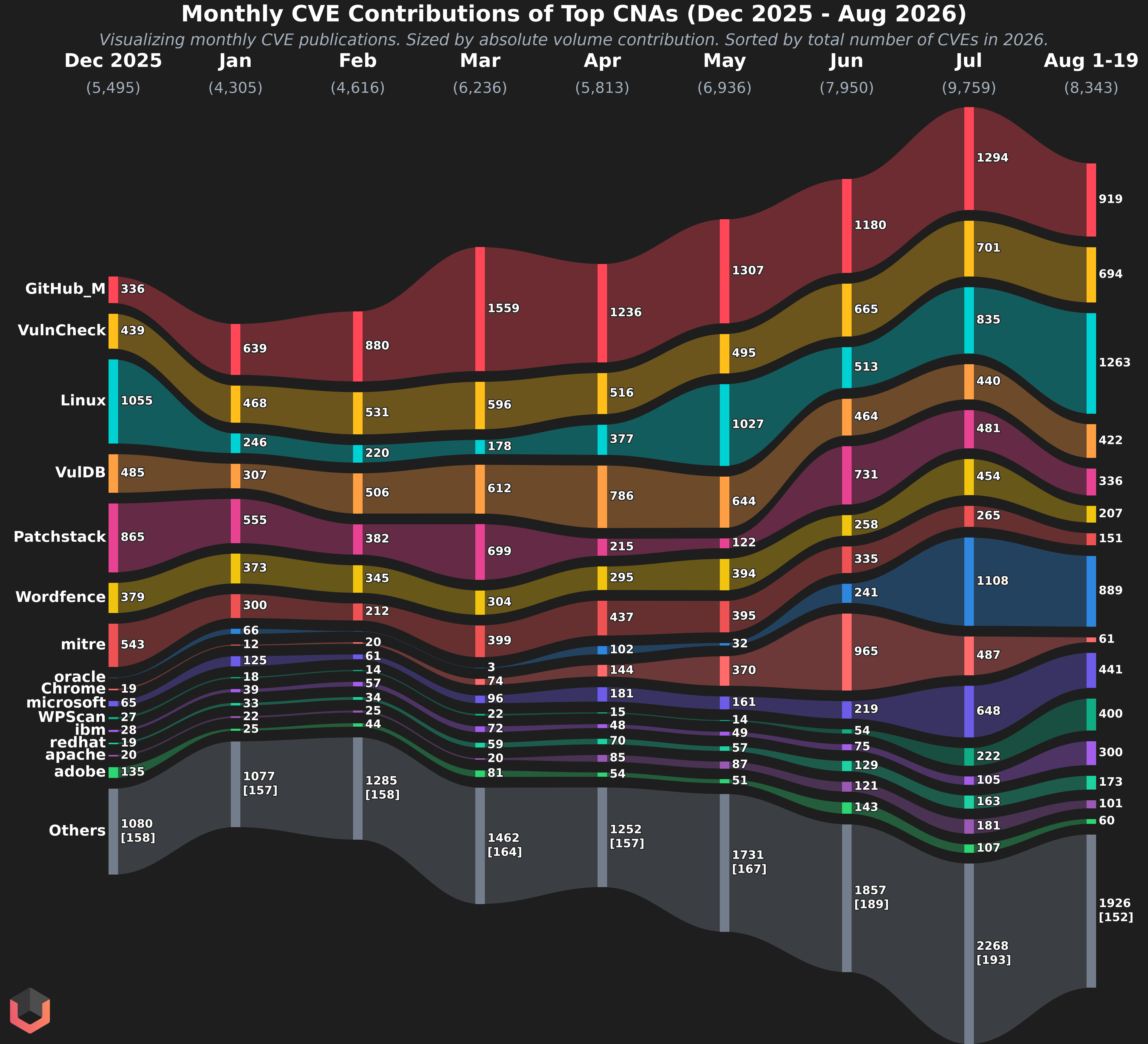
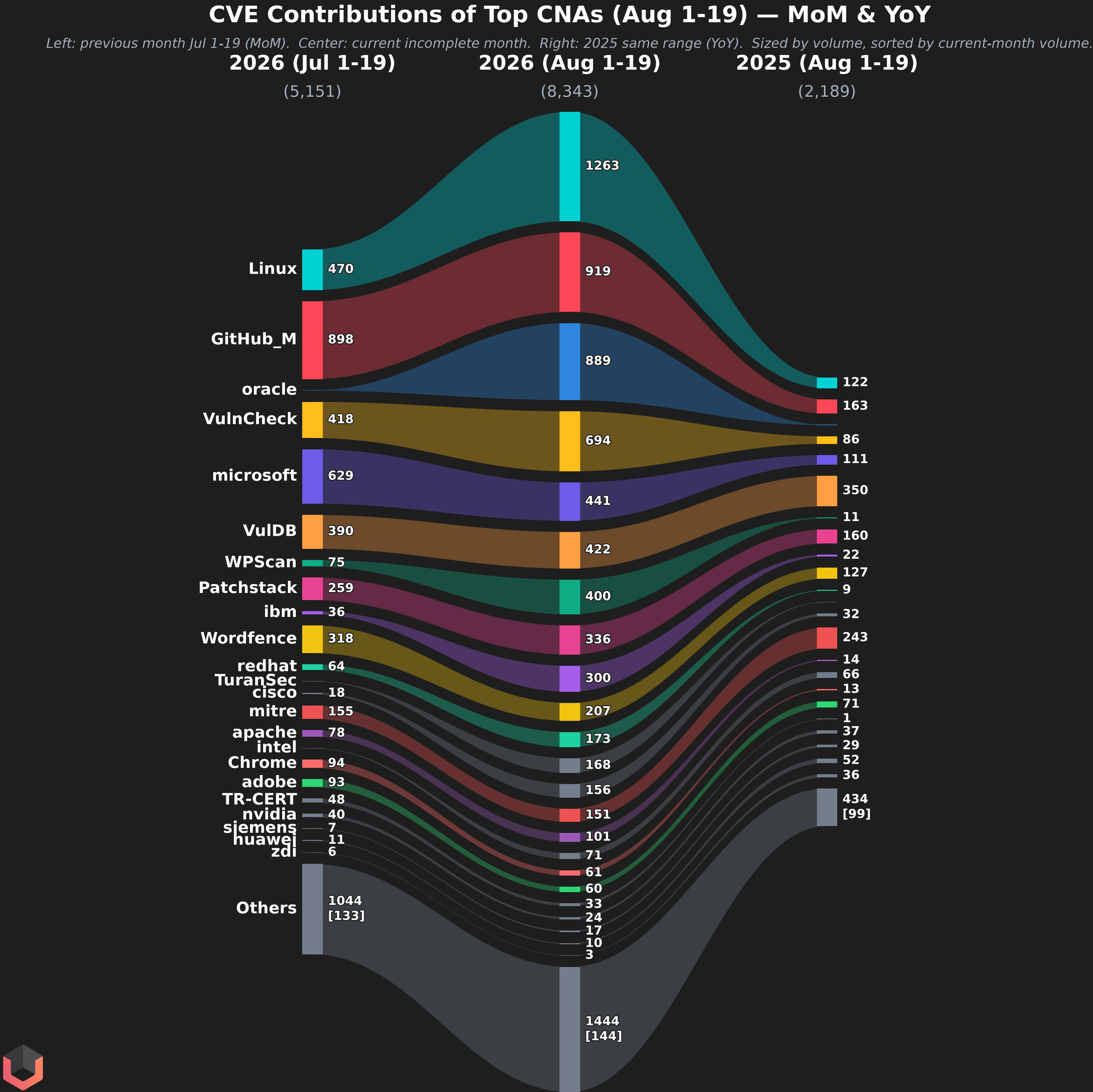
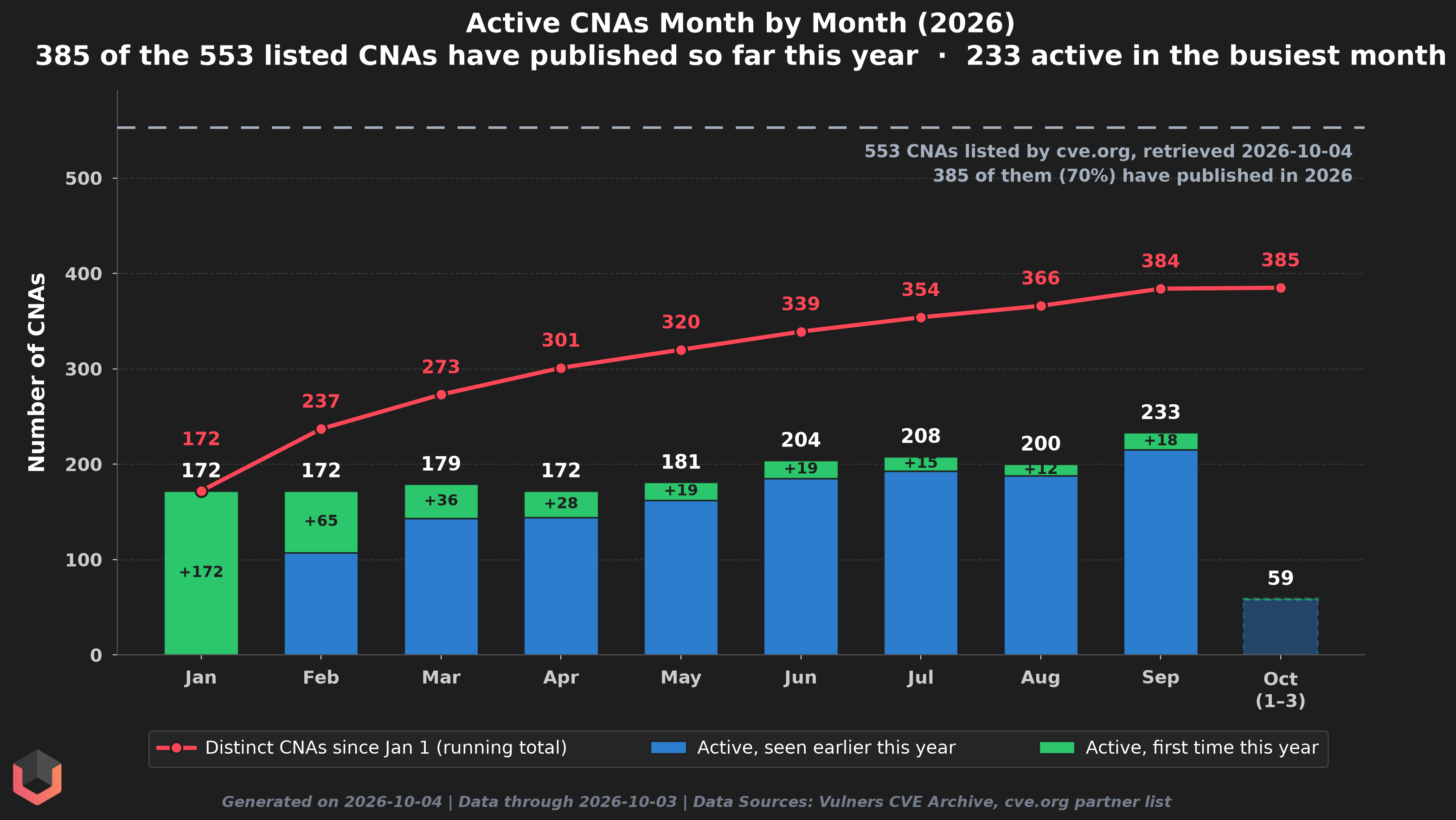
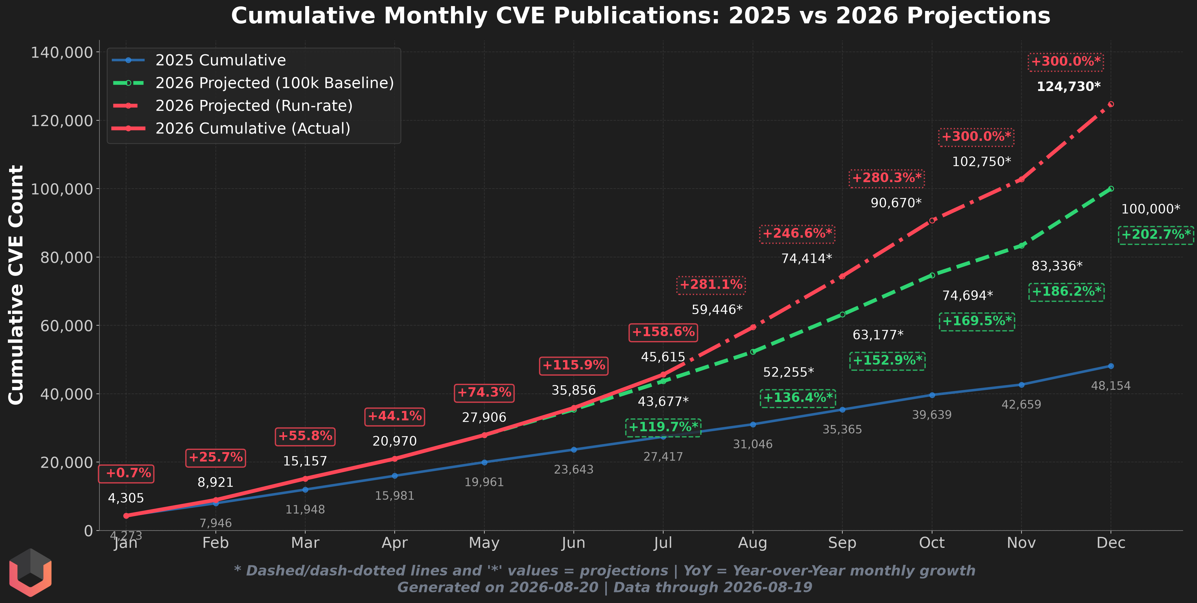
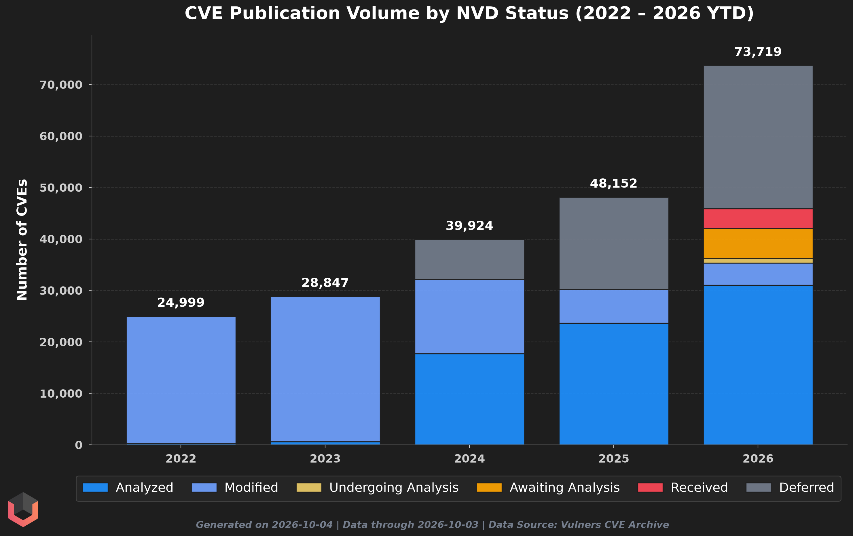
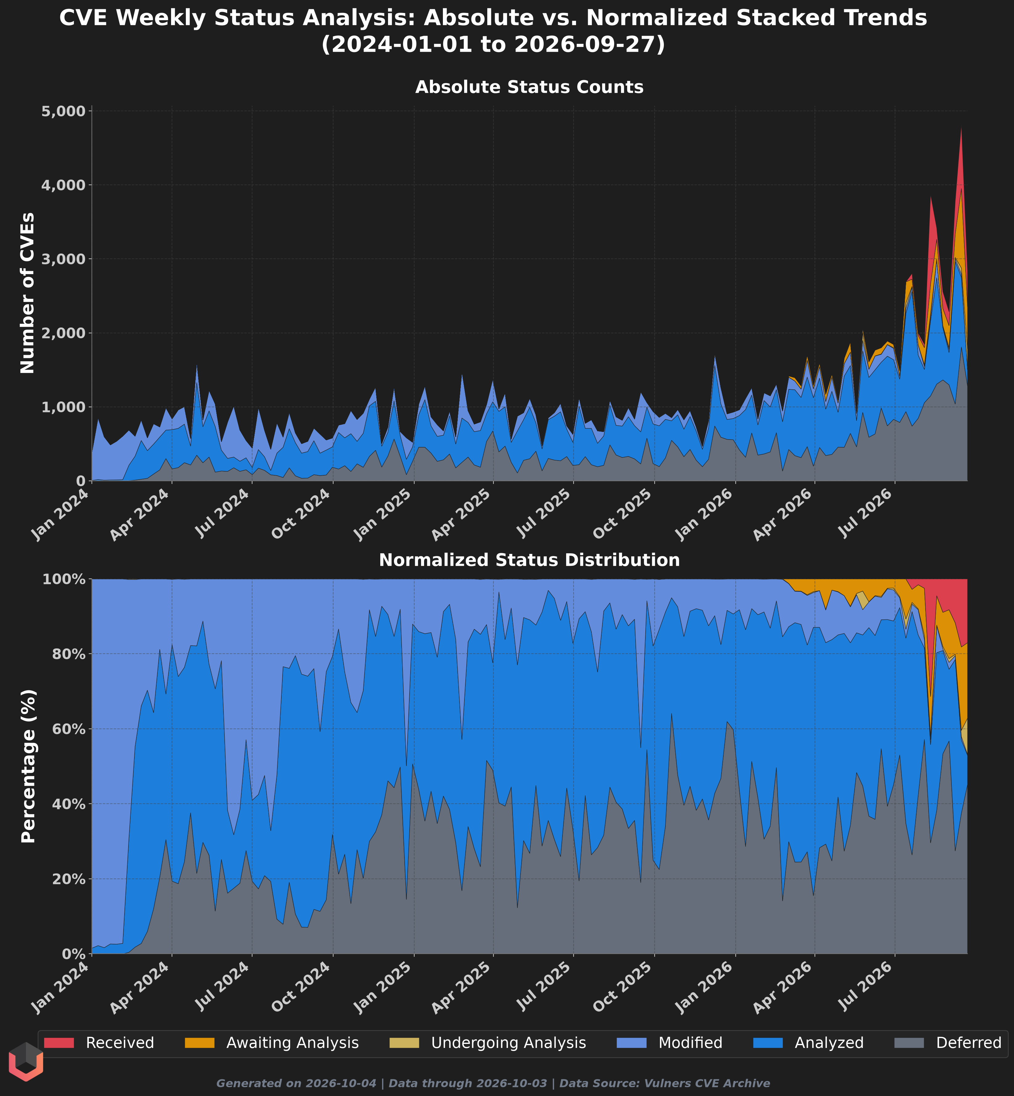
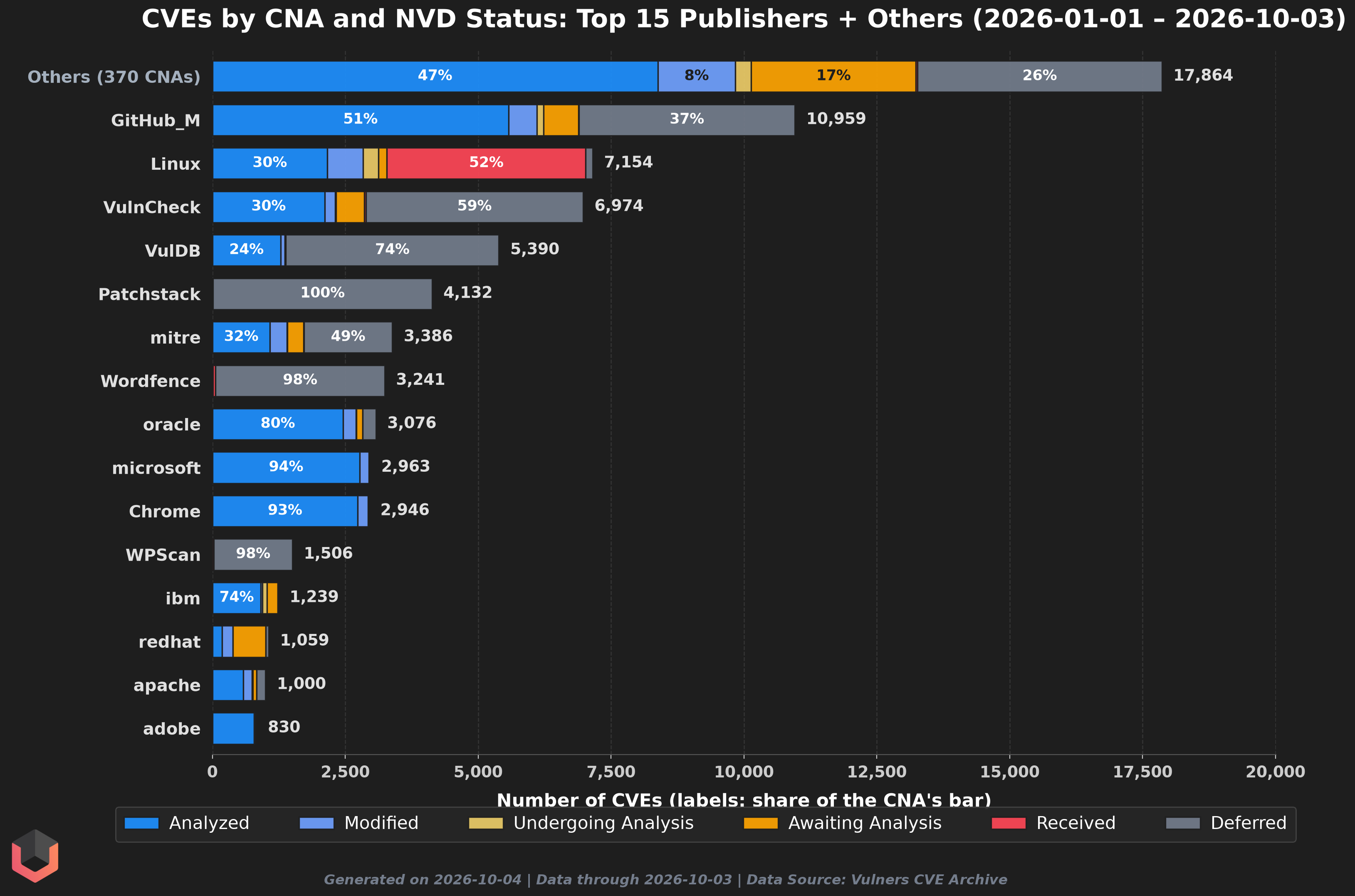
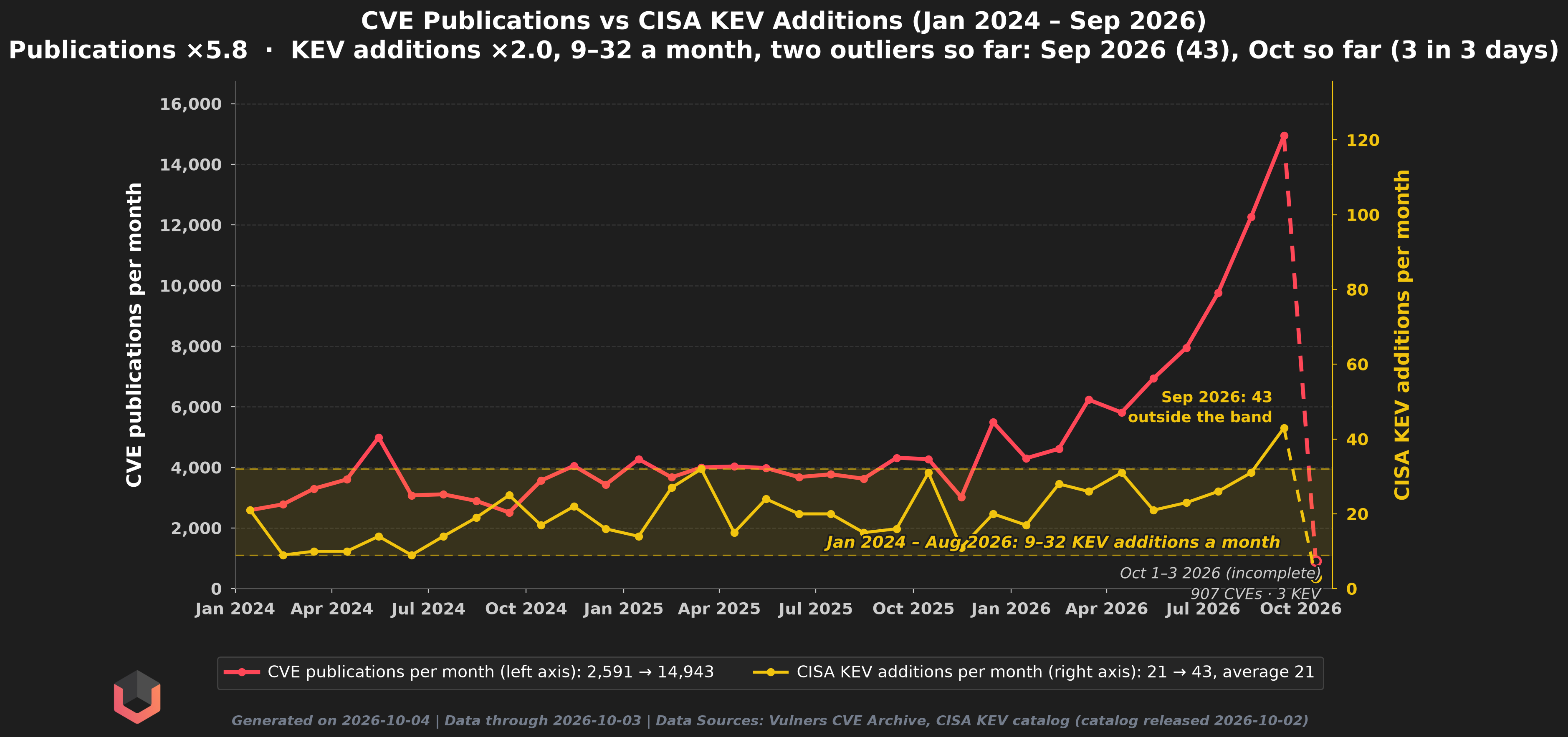
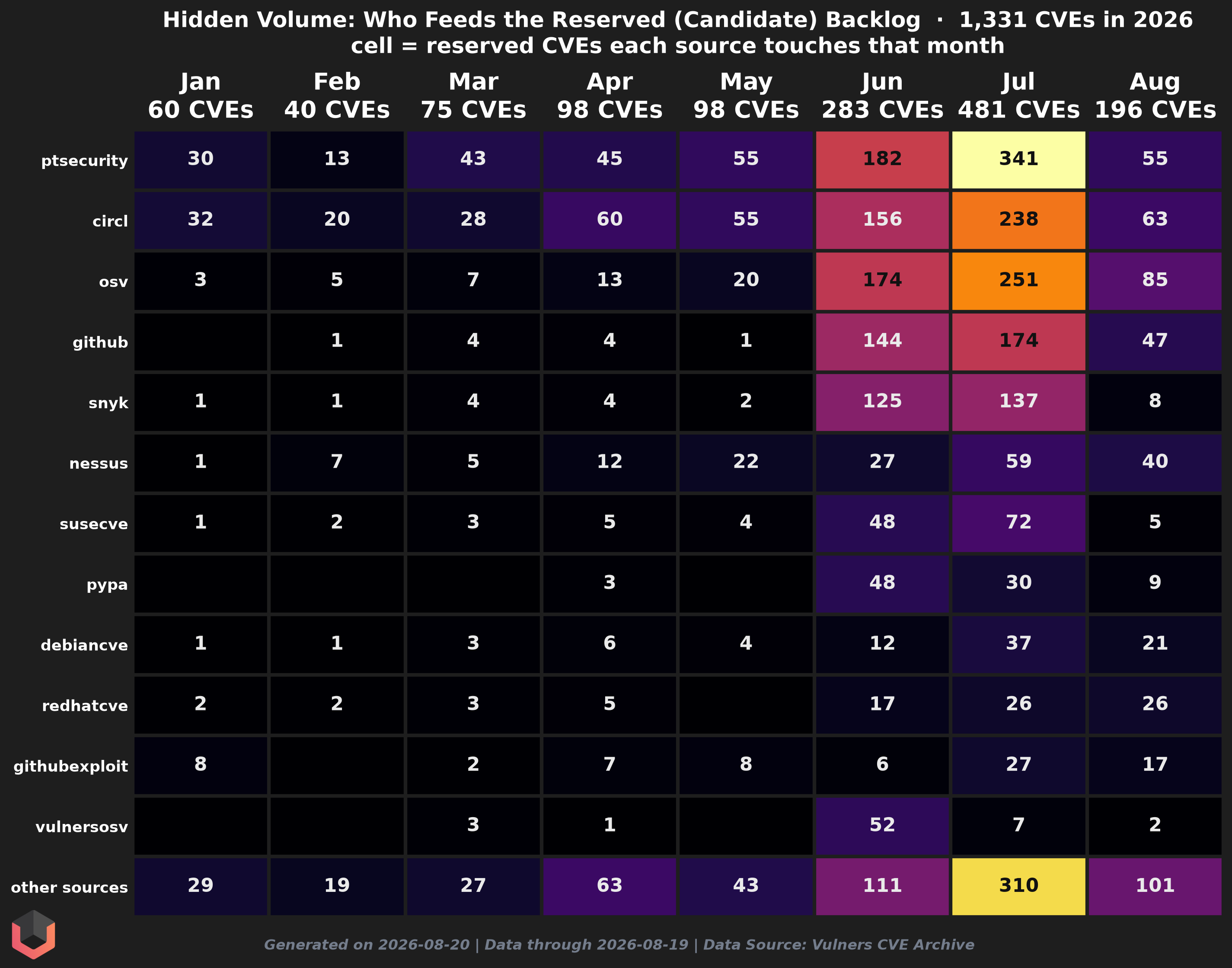
Five years, five lines, one very rude red one. The newest year crosses the full-year totals of earlier years long before its own twelve months are up, then keeps climbing like the finish line owed it money. Numbers that took those years a whole year to reach, it reaches with months to spare. The gap between the red line and the pack is not a rendering glitch. That is just the tide coming in.#This is the speedometer, and the needle is pinned. The current year sits well above the prior year's line and stays there. The two lines shook hands once, early on, and have not spoken since.#The lines above tell you how fast; this one tells you who. The same firehose, sliced by month and split by CNA, so you can watch the ribbons swell. Every column hangs from the same line and is drawn to one scale, so a height means the same number of CVEs wherever it sits: trace one CNA's band across the months, or measure a handful of the newest month's publishers against everything an earlier month managed. The dashed line carries one whole month across the picture for exactly that — wherever it crosses, everything above it is that month's worth of CVEs. This is what "more of everything, from everyone" looks like when you actually draw it.#Down from the whole year to a single window. Three snapshots of the exact same slice of the calendar, lined up side by side: this month so far in the middle, the same days of last month on the left, and the same stretch a year ago on the right. Same window, three different levels of pain. It answers two questions at a glance, whether the current month is already outrunning the one before it, and how much further ahead of last year the whole pipeline has drifted. The current column is rarely the short one.#Before anyone starts guessing at year-end, a headcount. Every chart so far counts CVEs; this one counts the publishers behind them. A CNA is active in a month if it put out at least one CVE that month, and the bar says how many did. The green slice is the ones turning up for the first time this year, and the red line is the running tally of distinct publishers since January 1st, which climbs by exactly that slice every month. The dashed line above everything is the whole roster — every CNA the CVE Program currently lists, pulled fresh from cve.org's own partner list — so the gap between it and the red line is the publishers that have been silent all year. Two things to read. The bars barely move while the CVE counts keep climbing, so the extra volume is the same crowd publishing more, not a crowd that doubled. And the red line never flattens — there is always one more publisher that was quiet until now, which is the part the projections below have to live with.#Two ways to guess where this ends, and neither one lets you sleep. One line runs the current rate forward; the other draws the rounder baseline. Both land well above where the prior year finished, which already reads like the good old days. The asterisks mean projection. The slope means call the cavalry.#Counting is one thing; looking is another. Every CVE published carries an NVD status that says how far the analysts got with it, and this stacks a year's worth of them into one bar. The blue is what NVD has actually analysed. The gray at the top is Deferred: waved through without a look. The warm colors are the queue, everything still waiting its turn. Watch how the bars grow, and watch how much of each new bar is anything other than blue.#The same statuses, week by week, full weeks only. The top chart is the raw count, so the spikes are the weeks that hurt. The bottom chart squeezes every week to the same height, so what is left is the mix: how much of each week's output got analysed, how much was deferred, and how much is still sitting in the queue. When the warm band at the top grows, the backlog is growing faster than the analysts.#Same statuses, third cut: whose CVEs they are. Every CVE published since the first of January, grouped by the CNA that issued it, one bar per publisher, as long as its volume. The fifteen biggest publishers get a row of their own; everyone else shares the top one. The numbers inside a bar are that publisher's own mix in percent. Blue is what NVD analysed, gray is what it deferred without a look, and the warm colors are the queue. Read down the gray: some publishers are waved through almost wholesale, others barely at all. Read down the warm colors to see whose backlog it actually is.#The pile outgrows the people reading it. Does the part attackers actually use grow with it too? The red line is every CVE published in a month, on the left axis. The yellow line is how many CVEs CISA added to its Known Exploited Vulnerabilities catalog that month, on the right. The two axes are scaled so both lines start at the same height, which makes the picture honest about multiples: if exploitation kept pace with publication, the yellow line would climb alongside the red one. The shaded band is the range KEV additions covered from the first month through August 2026, lowest month to highest, held fixed since: any later month outside it is labelled as an outlier at its own point, and the title counts them, the month still running (the dashed tail) included.#And here is the part nobody counts. These are CVE IDs already reserved but not yet published — the queue behind the curtain, the storm still out at sea, none of it counted in the numbers above. Each row is a source feeding that backlog; each column is a month; the brighter the cell, the more reserved CVEs that source touched. Read a column to see who's driving the month, and watch the rows: a band that sits dark and then suddenly lights up is a new source arriving — the next wave forming before it breaks. Whatever the rest of this page frightened you with, it hasn't counted these yet.#